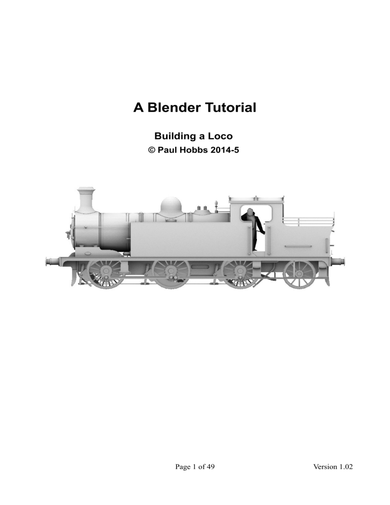
A Blender Tutorial Building a Loco © Paul Hobbs 2014-5 Page 1 of 49 Version 1.02 Contents Why Blender?.......................................................................................................................................3 Disadvantages.......................................................................................................................................3 About this Tutorial................................................................................................................................3 The Interface.........................................................................................................................................5 Editing and Selecting Elements............................................................................................................8 The 3D Cursor......................................................................................................................................9 Considerations When Using Available Drawings...............................................................................10 Using Background Images..................................................................................................................11 Wheels................................................................................................................................................16 Creating Pipes and Handrails.............................................................................................................22 Inside Motion......................................................................................................................................27 UV Mapping.......................................................................................................................................38 Creating The AO Bitmap....................................................................................................................40 LOD....................................................................................................................................................41 Page 2 of 49 Version 1.02 Why Blender? Well, it's free, fast and stable. It can also be used for very complex models – it's much more suitable than GMax for example when working with large and highly detailed models – and it includes everything you might need to make mapping and texturing easier in one package. It can render and also 'bake' the results into the texture which means that highlights and shadows can be automatically generated, saving hours of work assuming you have the artistic ability to do this manually. Additionally an exporter for Trainz is available, there are numerous tutorials on the Internet and the program is still being actively developed. Since I started to write this it has become apparent that N3V are heading in the direction that Blender will be the free program of choice for creating assets for Trainz. GMax is no longer supported and cannot do the things that are needed for good looking effcient assets. SketchUp may be easier to use but the models it creates are terribly inefficient unless you know what you are doing - but then if you know what you are doing you wouldn't be using it in the first place. You can get Blender here: http://www.blender.org. This tutorial assumes you will be using version 2.71 or later, this can be used without an installer so you can simply copy the whole Blender application anywhere you want without installing it, for example onto a USB stick. It's about 140Mb in size and very fast so it works well from a stick. However, I'd recommend that you use the installer and install it like any other Windows program, but in c:/Blender to avoid any permissions problems that might occur if you install it in the usual locations. This will allow you to double click on a file to open it for example which is not the case if you are using the 'portable' (i.e. from an USB stick) version. Versions are available for Windows, Linux and Macs (and it doesn't have any problems running under Vista, Windows 7, 8 and 8.1 (unlike Gmax). Disadvantages The user interface is different to 'normal' Windows programs although this is true of most 3D editors. Stick at it though, as once you are used to it you can work very fast and effectively. About this Tutorial This tutorial will attempt to guide you through the steps necessary to create your own 3D models which can be used in the Trainz Railway Simulator or any other program for which you can find an exporter. I won't attempt to explain all of the possibilities that Blender offers as firstly I haven't found out myself yet, and secondly a lot of the more advanced stuff just isn't needed. You'll need to bring a certain amount of patience and perseverance with you, learning a new 3D application is a bit like learning a new language – you have to work at it. Once mastered you can create any model that you desire though, so it is worth it. I couldn't use Blender either until I tried. If you get stuck there are many, many other tutorials as PDFs or videos available on the Internet, but most of them use earlier versions of Blender. As Blender develops some major changes have been made to the interface which render the earlier tutorials out of Page 3 of 49 Version 1.02 date, so check to make sure that they are still relevant. This tutorial will deliberately concentrate on the bits of Blender that are important for creating meshes for Trainz and won't attempt to go into all the possibilities that Blender offers. Checking out some of the many tutorials on YouTube for the Blender interface would be useful though. A useful resource is the Trainz WikiBook at http://en.wikibooks.org/wiki/Trainz/Tutorial_for_Blender which covers texturing, mapping and animation. It also has links to videos and other tutorials. If you have access to an IOS or Android device there are also training courses available which can be useful for learning the basics. Page 4 of 49 Version 1.02 The Interface Once Blender starts you are presented with the following screen: Illustration 1: The initial default screen when opening Blender for the first time The 3D Cursor is the point at which new objects will be inserted, but it also has other uses which we'll come to later. It's position is set by a left mouse button click, so you'll have to get out of the habit of left clicking to select something, although this can be changed I don't recommend doing this as changing the Interface around too much will make it harder to follow this and other tutorials. If you are coming from using v2.49 you'll notice that the initial display shows the default cube in a 3D view. This is to make it clearer what exactly you are looking at. Although the Interface looks a lot different to v2.49 at first glance a second look will reveal some familiar controls in new locations. The new interface by default has a more useful selection of windows open right from the start and it is possible to configure it for particular operations such as mesh modelling or UV mapping. In fact it's possible to get in such a mess by changing things around one of the first things to do is to find out how to reset it back to the standard layout. You do this by choosing File → Load factory settings. This will put everything back to the 'out of the box' state including the window layout. Page 5 of 49 Version 1.02 OK, now with the mouse cursor over the main graphic window hold down the middle mouse button and move the mouse. The scene will rotate to show it from a different angle. When Blender starts it loads a default scene which includes a cube which is outlined in pink to denote that it is currently selected.– which is not a bad thing as you can edit the cube to look like anything you like. You can move the cube around by left clicking and dragging on one of the axis arrows . Also note the yellowish dot at the centre of the cube, this is the local origin point of the object (the pivot point in the GMax context) which among other things is useful when mirroring objects. Panning the view is achieved by dragging with the middle mouse Illustration 2: Axis arrows and local origin point button and SHIFT, zooming with the middle mouse button and CTRL (or with the mouse wheel if you have one). If you get lost pressing SHIFT-C will zoom the view to show everything and also centre the 3D cursor at 0,0,0 (handy when you accidentally left click). You may find it useful to create extra views on the model you are making, although his is not so important as it was in v2.49 as there is a way of toggling a 4 view display in v2.65 upwards. To do this choose 'View → Toggle Quad View' or press CTRL-ALT-Q. To create a new window place the cursor on the splitter widget (top right of the window , looks like a thumb grip) and drag down to split the window horizontally or left to split it vertically. You should now see that you have two 3D windows looking at the cube. Illustration 3: The splitter widget Illustration 4: The 3D window type icon Each window on the screen has a particular type, in this case '3D'. Things get more interesting when you realise that the type can be changed. You can of course split up the main 3D window further to provide top, side and front views for working with plans. The view direction is changed using the numpad number keys Page 6 of 49 Version 1.02 when the mouse cursor is over the window, 1 is front, 3 is side and 7 is top. To reverse the direction of view to get a rear view for example use CTRL and 1. When working on a computer without a numeric keypad you need to set an option so that this will work. To set the option choose File → User Preferences from the menu bar at the top of the Blender main window (or press CTRL-ALT-U). Choose the 'Input' tab and then select the check box 'Emulate Numpad'. Illustration 5: Turning on the 'Emulate Numpad' option Click on 'Save User Settings' to make this change permanent so that you don't have to do this each time you start Blender. I should have said of course that once a window has been split you can join them back together again by left dragging the splitter widget over another window. Any of the windows on screen can be maximised by using CTRL up arrow and minimised again using CTRL down arrow. This can be useful if you are working on a screen with a low resolution. Fairly obviously the windows can also be resized by dragging the borders and views can be changed using menu selections, but it is far faster to use the keyboard short cuts. Illustration 6: Saving the user settings Interestingly the options and windows that you set up are stored in the .blend file itself, not separately so each model retains the interface set up that you choose and when reopened looks exactly the same as you left it. The model that Blender opens when it starts can be Page 7 of 49 Version 1.02 changed to something that suits your preferences by simply setting up the interface and hitting CTRL-U. The next time you start Blender you will get your 'Start model' instead of the default. At this point it would be a good idea to practice using the interface by splitting windows and rotating, panning and zooming the scene until you have the hang of it. Editing and Selecting Elements We've already seen that complete objects can be moved around in 3D space (left click and drag the axis arrows) and that selections are made by default with the right mouse button. It is also of course possible to edit the vertices, faces and edges of an object. To do this we have to change the selection mode. Illustration 7: Changing the 3D mode Here we are in 'Object Mode' which allows the manipulation of whole objects. Click on this field and choose 'Edit Mode' (or press the TAB key). Assuming the cube was already selected the display changes to this. All of the vertices are now selected. Hit A to deselect, A again to select all. With all of the vertices deselected you can select one with the right mouse button and move it around using the red, green and blue axis arrows. More than one vertex can be selected by holding down the SHIFT key when right clicking. Illustration 8: Cube in edit mode (vertex) Faces and edges can be selected instead of vertices by selecting one of the icons shown here. Once something has been selected it can be 'grabbed' with the G key and moved along one of the axes by then hitting X, Y or Z. There are also other possibilities to select things other than by clicking on them directly, such as B for a box selection or C for a circular 'brush'. Practice now selecting and moving Illustration 9: Vertex, edge and face selection modes things around, CTRL-Z will undo any changes if they are not what you want. Page 8 of 49 Version 1.02 The 3D Cursor One of the most important things that you see in a 3D window is the 3D cursor (the red/white circle seen here). This sets the position of newly created elements among other things. If you click with the left mouse button somewhere in the 3D window the cursor will move. Choosing 'Add → Mesh → Cube' from the menu at the top of the Blender window will insert a new cube at the cursor. Illustration 10: 2nd cube added at the 3D cursor This is useful for creating geometry in position the correct place to start with. We'll see this in action once we start making the wheels. Actually the position of the 3D cursor is so important and it's so easy to change it accidentally there is a debate going on in the Blender community that it would be a good idea to require a SHIFT-CTRL left click sequence to move it. I recommend changing it yourself to make it harder to move the cursor without meaning to. Choose File → User preferences from the menu and click on the 'Input' tab. Under '3d View' and 'Set 3D Cursor' click on the field to the right of 'Mouse' and then click the left mouse button with SHIFT and CTRL held down. Illustration 11: Changing the key assignment for setting the 3D cursor The field will change to look like this. Finally Page 9 of 49 Version 1.02 choose 'Save User Settings at the bottom of the dialog to confirm the change. Note that these settings are not stored in the *.blend file, they apply to the whole Blender program. Before you get carried away with changing key assignments it's best to leave things as they are until you know enough to do modelling without tutorials. That's about it for the basics of Blender, I believe the best way to learn new 3D software is to actually use it, so we'll build a loco now and pick up the other techniques as we go along. You could equally well build a house or a wagon, but it's a good idea not to start with anything too complicated – my first loco was a simple diesel shunter which had the wheels hidden by skirts, not a BR standard loco with outside valve gear. You might like to look at some of the many YouTube tutorials on the Blender interface should you wish to know more, but I'll mention the essentials as we go. I'm not going to detail the making of a specific loco this time around as it's hard to pick one that will illustrate all of the problems you might run into, plus I'd like people to build their own favourite loco instead of copying my example. Whatever you want to make it's a good idea to have plans available and to use them to ensure that the proportions are correct, so the next thing to know is how to do this. Considerations When Using Available Drawings Firstly don't assume that the drawing is correct – for example some drawings published in the last few years in the UK magazine 'Railway Modeller' were full of howlers or even incomplete. Especially as nowadays the drawings are usually prepared on a computer there is a tendency to use an existing drawing as the basis for another so you may find parts of the drawing may not apply to the locomotive (or whatever) it is supposed to represent. Dimensions can also be downright wrong. I've seen drawings where the wheel sizes and wheelbases were clearly a long way out, so check any text supplied with the drawing for clues for what the dimensions should be. It's a good idea to have photographs of the prototype as well to check the drawing, and although it's normally not recommended to use photos of models these can be clearer than prototype photos - just remember that not all models are correct either. Secondly don't assume that if you've scanned a drawing in that the scale in both axes is correct. The scale in the scan direction along the axis of the scanning head will be constant, but probably not in the other direction as this is dependent on the speed that the scanning head moves. A cheap scanner may well not move at a constant speed and this may mean that the scale in that direction could be variable. In the next section we'll look at a suggestion for minimising the impact this could have. Lastly don't assume that the drawing is symmetrical about the centreline or that it has even been drawn correctly. For example several of the drawings by Roche have different diameters of smokebox door in the front and side elevations which have mislead even commercial manufacturers over the years. Although correcting mistakes in a Blender model is a lot easier than taking a real model apart it's still annoying to build a model that is out of proportion because the drawing was wrong in the first place. Page 10 of 49 Version 1.02 Using Background Images With GMax and Max it was usual to apply the plans to a box or planes as a texture, but this is not a good idea in Blender. The problem is that to display the plans you have to be in the texture display mode which means the 3D model is as well and gets in the way. Also if you switch the model to wireframe mode the textures cannot be seen. Blender has the ability to display a background picture in each view (which works properly, unlike the similar function in GMax) which is the best solution. A few words now on finding plans, I've created some Google spreadsheets which list drawings and other articles in the UK magazines 'Railway Modeller', 'Model Railway Constructor' and 'Model Railways' and here are links to them: Link to Index for Railway Modeller: https://docs.google.com/spreadsheet/...UE&usp=sharing Link to Index for 'Model Railways': https://docs.google.com/spreadsheet/...Xc&usp=sharing Link to Index for 'Model Railway Constructor': https://docs.google.com/spreadsheet/...VE&usp=sharing In case you are wondering where to get ancient copies of these magazines I recommend Magazine Exchange, back numbers cost less than new magazines. The web site can be found here: www.magazineexchange.co.uk/ Link to the original thread on the Auran Forum: http://forums.auran.com/trainz/showthread.php?95269-Railway-Modeller-Magazine-Index%28UK%29 They can also occasionally be found on Ebay. Prepare the plans by scanning them in and cropping them in a bitmap editor such as PaintShop Pro or GIMP, they can be any scale and (almost) any format (GIF or JPEG are good). The bitmaps don't have to be any particular size and do not have to be square – I usually scan the drawings at 300 dpi which gives good detail and a reasonable file size. I'm using in this case a drawing of a LNER B12/3 4-6-0 loco, which was published in the Railway Modeller for November 1972 (should you wish to build one). Scan the plan in and make sure that the horizontal lines really are horizontal, rotating the image if necessary. Crop the image to make side, front and rear images (if the drawing has them of course), ensuring that the height of each is the same. Obviously if you have a top view you can prepare that as well. The first step is simply to press N to open the properties window (make sure that the mouse cursor is over the 3D window when you do this). Pressing N again toggles the window off by the way. Illustration 12: The properties window (opened by pressing N) Page 11 of 49 Version 1.02 To display a bitmap in the 3D window scroll the properties window down (unless you have a huge screen) and select the 'Background image' checkbox, and then click on 'Add Image'. Illustration 13: Adding a background image You'll probably need to scroll down again to see the next part of the dialogue. The 'Open' button allows you to select the image to use as for the background in the usual manner of all Windows programs. Illustration 14: Selecting the image to use This is the result. If you now change the view by pressing 1, 3, 7 etc you'll notice that the same image appears in all of them which is not what we want. Illustration 15: Background image loaded Page 12 of 49 Version 1.02 To fix this choose 'Left' from the axis menu – now the image only appears when you press the CTRL-3 numpad key. In the other views it will be hidden. Other useful options in this dialogue are 'Opacity' which sets the transparency of the image and the 'Front' and 'Back' buttons which move the image in front of or behind the model. 'Front' is generally more useful as the mesh is always visible providing the image has some opacity. This is I believe different to V2.49b and certainly an improvement. Illustration 16: Changing the view in which the image is visible Now we need to scale the image which means you need to know the total length over buffers of the loco (and tender if it has one). Scaling the original drawing the length seems to be 17.48m although in one book it should be 57ft 9ins (17.60m) and in Wikipedia 57ft 7ins (17.55m). I'm going to assume for the moment that 17.55m is correct, but once we have built the wheelsets we can double check using figure for the wheelbase – this is usually easy to find out and didn't change as much as the length over buffers (different buffers could have been fitted at different times). I take a lot of care over getting the scaling right as it can be a pain to change things later. The drawing is least likely to be accurate by the way as the printing process isn't that accurate and in some old magazines it seems they scaled the drawings to fit the available space(!). Note that in this case we have a view on the RHS of the loco and it is very important to start building the model in the correct orientation in 3D space. The front of the loco must be in the -Y direction. Here I've selected the 'Front' option in the properties window to bring the Illustration 17: Image scaled correctly image in front of the cube. Page 13 of 49 Version 1.02 The final result is shown above. The 'Size' value in the property window for the positioning of the image needs to be half the length over buffers but don't ask me why the Y value is the same, I have never figured that out. The image is centred at 0,0,0 which means that for a tender loco the loco body, the tender and all of the bogies need to be moved before exporting as each vehicle must be centred at 0,0,0 in Trainz. This is slightly more work later but it's much easier to scale the background image this way. Another possibility is to build the loco and tender in separate blend files with two separate background images but I prefer to do it all in one file – in fact if the loco and tender are separate drawings I would combine them in a bitmap editing program before starting. For a tank loco the meshes will not need moving before exporting. Illustration 18: Scaling settings To anybody used to working with the fuzzy, inaccurate display of plans that GMax is limited to, the quality of the background images will be a welcome surprise. Blender has another surprise up it's sleeve though, the bitmaps that you use for texture and background images can be stored in the *.blend file itself. This means that the one working file contains all of the information need to display it properly. Selecting the tiny icon highlighted here tells Blender that the image should be packed into the *.blend file. To actually pack the images you need to Illustration 19: Packing the background image choose 'File-> External Data-> Pack into .blend file'. Finally 'File->Save' (or CTRL-W) will save the *.blend file together with the embedded bitmaps. It's a good idea to avoid huge bitmaps though, these will increase the loading and saving times. You can also unpack the bitmaps again if you need to do so. Repeat the steps outlined so far to create views for each of the scans that you have, i.e. side, front and rear views. If you've been paying attention you should be able to get this far without too much trouble: Note that the side, front and back views are named '... Ortho' This is 3D application speak for 'display without perspective', which is important for views that contain background images. You switch between Ortho and Perspective by hitting the numpad 5 key – try it on the main 3D window to see the difference. Having set up the interface and prepared the plans we can now start to model. There are only a few basic techniques needed for this such as creating a profile and adding a Page 14 of 49 Version 1.02 thickness and rotating a profile to make a round object. Page 15 of 49 Version 1.02 Wheels To make the wheels I'm going to use my wheelkit *.blend file, this is optimised to make creating new wheelsets as painless as possible although you could also just use one of the ready made wheelsets from my library. This will also teach you about rotating and copying existing objects, in fact creating the wheelsets will introduce just about everything you need to build the rest of the model so it's worth working your way through this bit. Download the wheelkit from here and press SHIFT- C with the mouse cursor over the 3D window to centre the 3D cursor at 0,0,0. Delete the default cube by right clicking on it to select it and then press X to remove it. Illustration 20: Appending the objects in the wheelkit file Now press SHIFT-F1 to open the append dialog box and navigate to where you saved the 'driving_wheel_kit.blend' file Open the 'Objects' folder and select all of the elements that are visible in the file by pressing A when the mouse cursor is over the window showing the object names they will then be highlighted. Finally click on the 'Link/Append from Library' button at the top right of the dialog box. Illustration 21: The objects in the wheelkit file All of the objects from the wheelkit file have now been appended to the file centred at 0,0,0 but retaining their positions relative to each other. Any Blender file can be used as a library in this fashion incidentally. Illustration 22: Wheelkit objects loaded Page 16 of 49 Version 1.02 Let's take a closer look at the objects from the wheelkit library file which have been constructed to minimise the amount of work needed to create a wheel set of any size. The cube like object b.r.w1 is a lattice (a dummy in GMax) which has already been animated over 30 frames. The other objects are linked to it and so are also animated. wk_rimprofile, wk_axleend, wk_crankboss13 and wk_spoke have been constructed on the left side and mirrored about the centreline so that any editing of the objects automatically happens on both sides. Illustration 23: The wheelkit objects wk_rimprofile object is hidden inside the axle in the above illustration as the wheelkit has been positioned at 0,0,0 initially, this will be swept around to create the wheel rim later. Here I've switched to wireframe view (just press Z) to show it better. Illustration 24: The wk_rimprofile object Blender works in 'Blender units' and by convention 1 Blender unit is 1 metre. The wheels on this loco are 6ft 6ins diameter so we need to move b.r.w1 up by (6,5*0.3048)/2 units as 1 ft is 0.3048 metres. So select b.r.w1 by right clicking on it and then press G then Z and then type 0.9906. Note that as most of the objects are linked to b.r.w1 they move with it (very useful). Illustration 25: b.r.w1 moved up Page 17 of 49 Version 1.02 Make sure that the bottom end of the spoke object is inside the wheel rim (i.e. is the spoke long enough to reach the rim, it can be slightly inside it to avoid any chance of a gap between the spoke and the rim). Likewise the spoke should not be so long that it appears to go through the rim... If the length of the spoke needs adjusting select it by right clicking it and enter edit mode by pressing TAB. Press A to deselect all of the vertices and faces in the spoke object, then make sure that the 'Vertex select' icon is selected and Illustration 26: The 'Vertex select' (on) the 'Limit selection to visible' icon is deselected. This last icon allows you to select vertices that are and 'Limit selection to visible' (off) icons hidden behind others so that you can be sure of selecting all 4 vertices that define the end of the spoke. Now make sure that the 'Snap during transformation' icon is turned off as we don't want to snap to anything in this case, just drag the vertices to some arbitrary position. Finally press B, drag a selection box around the end of the spoke and then press G and then Z and drag the vertices up or down to lengthen or shorten the spoke object. Illustration 27: The 'Snap during transformation' icon turned off Now move the 3D cursor to the centre of the b.r.w1 object by selecting b.r.w1 with the right mouse button and the press SHIFT-S and choose 'Cursor to selected' Illustration 28: Cursor moved to centre of b.r.w1 Change to the side view by pressing 3 and select the wk_rimprofile with the right mouse button. Change to Edit mode by pressing TAB. Page 18 of 49 Version 1.02 In the Tool shelf (this is toggled on and off by pressing T) click on 'Spin' and change the steps to 32 and the Angle to 360 to create the wheel rim. Important things to note about the Spin tool is the the spin is centred on the 3D cursor (which is why we moved it) and the axis of the spin is normal to the current view. If the wheel is extra large you might want to increase the number of steps or if it is small you could go down to about 16. I usually use either 24 or 32 steps. Illustration 29: The Tool shelf with the settings for the Spin tool A similar procedure can be used to create chimneys, domes, buffers or indeed any circular part.. Illustration 30: The finished wheel rim Page 19 of 49 Version 1.02 Now we'll copy the spokes radially. Select the spoke object with a right mouse click, edit mode by pressing TAB and then press CTRL-A to select all the vertices in the object. In the Toolbar (usually at the left hand side of the 3D viewport, if it is not visible pressing T will toggle it on) go into the 'Tools' tab. Illustration 31: The spin option in the 'Tools' tab of the Toolbar window The spin parameter dialogue will open at the bottom of the Toolbar. Change the steps to match the number of spokes the wheel should have, select the 'Dupli' (duplicate) option and set the angle to 360°. Illustration 32: Spin parameters Page 20 of 49 Version 1.02 And that's it for wheel creation except to note that as we started with a spoke at the bottom and then duplicated it 20 times in 360° we now have duplicated vertices for that spoke. Illustration 33: Wheel with spokes To fix this go back into edit mode, select all the vertices with CTRL-A and press W to open the Specials menu. Choose 'Remove doubles'. Illustration 34: Removing doubled vertices The spokes created by this method are pretty basic – actually they should flare into the crank boss, have fillets where they join the rim and the crank boss and they should also be oval in section and not rectangular. I must admit up until now I've never bothered with these refinements as it would make modelling the wheel a lot more complicated, but I see that some others have started to create better looking wheels than this... Page 21 of 49 Version 1.02 Creating Pipes and Handrails I resisted changing to Blender 2.5 and up for a long time as a very important feature was missing until about v2.70. This is the ability to bevel a vertex which comes in very handy when making pipes and handrails. If the pipe for handrail has bends in X, Y or Z then there are other possibilities but this method works even if the pipe bends in some other direction. The idea is to first sketch the centreline of the pipe with sharp corners and then to use the bevel tool to create the bends themselves. Finally the pipe can be created by 'thickening' the line. To illustrate this I'll just create a pipe in a new blend file. Starting with the default cube select it with the right mouse button and enter Edit mode by pressing TAB. Then press W and choose Merge → Collapse from the menu. Illustration 35: Cube in Edit mode, all vertices selected The cube will collapse down to a single vertex. This is a very handy way of creating a new object with just a single vertex. Illustration 36: Cube collapsed to a single vertex Make sure you are in Vertex edit mode. Illustration 37: Vertex edit mode Page 22 of 49 Version 1.02 Press E and then Z to extrude the vertex upwards by moving the mouse and then left clicking with the mouse to set the position. Repeat in the X and Y directions to produce the pipe centreline as shown here. Illustration 38: Pipe centreline created Now select the vertices where the bends should appear → Illustration 39: Vertices for bevelling selected and press CTRL-B to start the bevel operation and then click with the left mouse button near the selected vertices. In the tool shelf make sure that 'Vertex only' is selected and type in the bevel distance in the Amount field. You can also drag with the left mouse button over this field to increase or decrease the value – this works with all of the numeric input fields in Blender. Illustration 40: The bevel options Page 23 of 49 Version 1.02 The result looks like this in the 3D window (here I've selected the vertices ready for the next step) Illustration 41: Pipe centreline after first bevel operation With the four vertices selected repeat the bevel operation to get this. This number of segments in the centreline is usually enough for most pipe bends. Illustration 42: Pipe centreline complete Now we have the pipe centreline we need to convert this into a curve, so in Object mode select the centreline and press ALT-C. Choose 'Curve from Mesh/Text' from the menu. A new tab will appear in the Properties window to allow the curve object to be modified. Note that this only appears when a curve object is selected. Illustration 43: Curve tab in the Properties window Page 24 of 49 Version 1.02 Change the Options in the properties window as shown here. For 'Fill' you can choose 'Half' or 'Full', 'Full' being a 360° pipe, 'Half' is only 180°. The 'Depth' value is the radius of the resulting pipe and 'Resolution' defines how many segments will be created per segment of the centreline. 1 is 6 sided, 2 is 8 sided and so on. Depending on the size of the pipe you might want to adjust this value. For reference a typical handrail would be about 32mm diameter. Illustration 44: Options for a Curve object in the Properties window Pipe object has been created – at this stage it is still possible to change the properties to adjust the diameter and the resolution of the pipe. Blender v2.49b could also do this, but it didn't work as well. Often it would twist some segments of the pipe which needed sorting out manually. Illustration 45: Pipe object created Page 25 of 49 Version 1.02 To convert the Curve object back to a mesh press 'ALT-C' again (with the pipe object selected of course...) and choose 'Mesh from Curve/Meta/Surf/Text' from the menu. Page 26 of 49 Version 1.02 Inside Motion It might seem a bit of overkill to model the inside motion of a steam loco but when the boiler is relatively high above the footplate you can easily see into the area between the frames and it's nice to have something representative here rather than just leaving it empty. The method of animating the inside connecting rods and the crossheads can also be used for outside motion as well. The objects needed for this operation can be found in my library file 'inside_motion.blend' which can be downloaded here. This started out as a part of Pikkabird's BR Jinty in about 2003, but since then I've moved just about every vertex of it. It is of course a very approximate version of the real thing but still looks OK between the frames. The basic idea is that the crosshead moves in a 100m radius arc instead of the mechanically correct straight line, but doing Illustration 46: The library file it this way means that any cylinder 'inside_motion.blend' inclination can be accommodated and it's easier to do than the alternatives. The original idea came from the late Bill Fock. I must admit I wouldn't do it this way now, but it is easy to understand and to do. I'll describe an alternative later which provides for perfect movement of the pistons even when they are inclined. Start by positioning the 3D cursor to the centre of the driving wheelset (the one that will have the crank axle, normally the centre one for a six coupled loco) in your working file by selecting the wheelset or the lattice that is centred on it with a right mouse click and then pressing SHIFT-S. Choose 'Cursor to selected' from the menu. Illustration 47: 3D cursor positioned at centre of driving wheelset Page 27 of 49 Version 1.02 Now merge all of the objects included in 'inside_motion.blend' into your working Blender file. At first sight it looks a little complicated and it might not be obvious why the objects are positioned as they are but trust me, the reason is to make adapting the geometry to any desired model with the least amount of work. Merging is carried out by pressing SHIFT-F1 , navigating to where the file has been saved and then selecting the objects to merge in. Illustration 48: The objects from 'inside_motion.blend' merged in Next select the crank axle with a right mouse click and press 'SHIFT-S'. Choose 'Selection to cursor' from the menu. The crank axle and most of the other objects loaded from the 'inside_motion.blend' file will jump to the new location with the crank axle centred on the driving wheelset. These objects are linked to the crank axle and therefore move and rotate with it. This makes positioning all of the objects correctly much easier. The objects that didn't move are the bones that control the animation, these need to be adjusted to match the final Illustration 49: Inside motion moved to centre of driving wheelset geometry once everything else has been positioned. The position of the cylinder block and the length of the connecting rods will need adjusting to suit the loco you are building. Here for example we are looking at a side view of a N15 0-6-2T with the cylinder block highlighted. You can see that the cylinders are too far back and are colliding with the front axle so we need to move the cylinder block forward and make the connecting rods longer. Illustration 50: Side view of loco with the inside motion object selected Page 28 of 49 Version 1.02 To do this select the cylinder block object and enter edit mode by pressing TAB. Ensure that you are in vertex edit mode by checking and if necessary correcting the selection icons at the bottom of the 3D window and select the vertices belonging to the cylinder block. It's probably easier to do this in the side view (press 3 to change the view). Illustration 51: Cylinder block in edit mode, verices selected ready to move Also make sure that this icon is deselected. This will enable you to select vertices that are hidden on the rear side of the object. Illustration 52: 'Limit selection to visible' icon deselected Now move the vertices forward until the cylinder block is roughly level with the rear face of the smokebox and clear of the front axle. Remember how far you moved it because you'll need to move the crossheads and extend the connecting rods by the same amount. In this case -0.35 was about right. Press G and then Y and then type the amount to move the vertices by. Obviously it's better to have the loco body visible when you are doing this... Illustration 53: Cylinder block moved forward to clear the front axle Page 29 of 49 Version 1.02 Move the crossheads and lengthen the connecting rods by selecting just the forward end of the rods by the same amount. Illustration 54: Crossheads moved forward and connecting rods lengthened Now we need to rotate the crank axle to move everything so that it clears the front axle. Select the crank axle with a right mouse click and type R X -5 (in this case a 5° rotation was about right). As most of the objects are still linked together they will all rotate by the same amount. Illustration 55: Crank axle rotated by 5° Now comes the fun part, animating the motion. First though we need to adjust the position of the bones that will control the animation to match the geometry that we now have. Move the 3D cursor to the centre of the object 'b.r.bigend_l_orig' using SHIFT-S as before. Illustration 56: 3D cursor moved to centre of 'b.r.bigend_l_orig' Page 30 of 49 Version 1.02 Select the object 'im_bone_l' with a right mouse click and enter edit mode by pressing TAB. Now select the rearmost vertex of the bone and press SHIFT-S again, choosing 'Selection to cursor' from the menu. The end of the bone will snap to the 3D cursor. Illustration 57: Rear vertex of bone moved to 3D cursor Now select the middle vertex of the bone, making sure that type of snapping element is set to vertex. Illustration 58: Middle bone vertex selected Press G, then Y and hold down the CTRL key to snap the bone vertex to the end of the line which is attached to the left crosshead object as shown here. Repeat with G then Z and CTRL to snap the bone vertex to the end of the same line as before. This will move the bone vertex to the same Y and Z coordinates as the end of the line which represents the centre of the little end of the connecting rod. Illustration 59: Snapping the middle bone vertex to the centre of the little end of the connecting rod Page 31 of 49 Version 1.02 This is the result. Note that the lattices which the meshes to the crosshead and connecting rod have not moved with the bone although they are linked. This is because we are still in edit mode and if we go into object mode by pressing TAB they will jump to the correct position. Illustration 60: Middle bone vertex in final position Here we are in object mode and the lattices are now in the correct position. Repeat the snapping operation for the lowest bone vertex point. Illustration 61: In object mode We can now animate the bone for the left side of the motion and we start by linking the 'im_connrod_l' object to 'b.r.connrod_l'. Do this by selecting 'im_connrod_l' and then 'b.r.connrod_l' (with SHIFT held down). Now press CTRL-P and choose 'Object' from the menu. Do the same for the 'im_crosshead_l' and the 'b.r.crosshead_l' objects, but first select ' im_crosshead_l' and press ALT-P choosing 'Clear and Keep Transformation', and then press CTRL-A and choose 'Rotation and Scale' to remove any transformations from Illustration 62: Linking the left connecting rod the object before linking it to the lattice. Failing to do this will result in the crosshead with the lattice object jumping to another position when it is Page 32 of 49 Version 1.02 linked. Similarly link 'bigend_l_orig' to 'b.r.w2' unlinking 'bigend_l_orig' first with ALT-P and clearing the transformations with CTRL-A. Link 'im_crank_axle' to 'b.r.w2', again unlinking and clearing the transformations. Now select the bone 'im_bone_l' and enter pose mode. Press TAB to edit the bone and with a right mouse click select the rearmost part of the bone as shown here. Illustration 63: Bone in pose mode Add a bone constraint by clicking on this tab and then on the 'Add Bone Constraint' button. Illustration 64: Adding a bone constraint Choose 'Inverse Kinematics' from the list. Illustration 65: Selecting the bone constraint Page 33 of 49 Version 1.02 For the Target choose 'bigend_l_orig' from the list. The animation for the left side of the motion is now set up and can be tested by pressing the play button. You'll notice that as the connecting rod and crosshead are mirrored on the right side they are moving in unison with the left side and don't line up with the crank axle, but don't worry, this is easy to correct. First of all make sure the animation is at frame 1 as shown here (easy to forget when you are playing around...) Illustration 66: Selecting the target for the inverse kinematic constraint Now select the object 'im_connrod_l' and make sure that you are in object mode. Then in the modifier tab click on the 'Apply' button – this will apply the mirror modifier to actually create the faces for the right hand connecting rod. Do the same for the 'im_crosshead_l' object. Illustration 67: Applying the mirror modifier Page 34 of 49 Version 1.02 Next we have to move the right hand connecting rod and crosshead into the correct position to match the crank axle. To do this select the object 'b.r.w2' and rotate it -90° by entering R X -90. Illustration 68: b.r.w2 rotated by -90° Select the object 'im_connrod_l' and enter edit mode by pressing TAB. Select the faces belonging to the right hand connecting rod and press P to separate them. Illustration 69: Faces of right hand connecting rod selected Do the same for the 'im_crosshead_l' object, not forgetting the two lines are are used to aid positioning the right hand bone object and for the 'bigend_r_orig' object. Illustration 70: Right hand crosshead object separated and selected Page 35 of 49 Version 1.02 Select the objects 'im_connrod_l.001' and 'im_crosshead_l.001' and press ALT-P choosing 'Clear and Keep Transformation', and then press CTRL-A and choose 'Rotation and Scale' to unlink them and reset the transformations. Rotate the object 'b.r.w2' back to the original position by entering R X 90. The right hand connecting rod and crosshead are now in the correct position for frame 1 of the animation. Illustration 71: b.r.w2 rotated back to original position Move the vertices of the 'im_bone_r' object to match the position of the vertices in the two lines that are attached to the right hand crosshead in the same way that we did it for the left hand side. Link 'bigend_r_orig' to 'b.r.w2', 'im_connrod_l.001' to 'b.r.connrod_r' and 'im_crosshead_l.001' to 'b.r.crosshead_r'. Add the inverse kinematic constraint to the 'im_bone_r' object as for the left hand side. The animation is now complete and things can be tidied up by deleting the helper lines and renaming the *.001 parts to make it clear that they are on the right hand side. Illustration 72: Animation complete As mentioned this technique can also be used for animating the connecting rods and crossheads of outside cylinder locos and in fact any part of the valve gear should this be visible. Page 36 of 49 Version 1.02 When creating the AO map for the inside motion I use the following settings for the cylinder block and the motion plate, moving them temporarily to the same layer as the loco body so that they pick up the shading from the surrounding parts. The settings should produce an AO map that is about as dark as the inside of the frames. The samples field is set to 5 (instead of the usual 10) to make the A0 map more grainy to match the inside of the loco frames. It's actually quite tricky to get the inside motion looking right, i.e. not too dark so that you can't see anything and not so light that it looks out of place. Illustration 73: AO settings for baking the cylinder block and the motion plate I find it annoying when this is not done as the objects between the frames should be noticeably darker than parts that are outside the frames for example. You can often see a similar effect when crew figures are placed in the cab which are not shaded darker by the cab sides and front – they stand out far too much, as if they are illuminated Illustration 74: Cylinder block and motion plate baked to match loco body Page 37 of 49 Version 1.02 UV Mapping UV Mapping is simply defining what areas of the skin (the bitmap that controls the colouring of the model) are 'mapped' to which faces. This has to be done in order to export the model to Trainz, so it is the next logical step after creating the mesh. Probably the most efficient way to tackle this is when building the mesh, as the mesh needs to be prepared with mapping in mind. The quick (and lazy) way to UV map the model is to use auto mapping which just involves selecting the mesh, entering Edit mode by pressing TAB, selecting all the faces by pressing A and then pressing U with the mouse cursor over the 3D window. Then just choose 'Smart UV project' from the menu. Illustration 75: Choosing the type of UV Mapping, all faces selected A few remarks on the settings – setting the Angle Limit as high as it will go (89) tends to create fewer islands. The 'Island Margin' separates the islands slightly which helps when texturing, but this can also be adjusted afterwards if necessary. 'Area Weight' I've never used (so I don't know what it does). Illustration 76: The options for Smart UV Project Page 38 of 49 Version 1.02 The result in the UV editor window looks like this: At first glance it doesn't look too bad but the disadvantage is that circular objects have been split up into four separate islands and there are a lot of islands which wastes space on the texture map if we want a couple of pixels between each one – it's a good idea to do this as otherwise you can get textures bleeding onto other faces. Illustration 77: Resultant UV Mapping (all faces selected) Here I've selected the boiler to show the splitting of the UV islands – this makes reskinning harder for third parties if the source *.blend file is not available although if you do have the *.blend file it doesn't really make a lot of difference. All of the round parts of the mesh will be split in to four separate islands which isn't what we want. The main problem with auto mapping is that it makes a messy map although it is quick to do. Illustration 78: Boiler faces selected Page 39 of 49 Version 1.02 Creating The AO Bitmap An ambient occlusion map is effectively a way of generating 'soft' shadows on the mesh which helps to bring out the detail. Without it the mesh will look flat and frankly not very good. For example here is a simple cube with just a white diffuse colour applied to it. Illustration 79: Cube with white diffuse texture applied And now with a AO texture which in this case is not much of an improvement. This is because ambient occlusion relies on something else in the scene to produce the shadowing. Here the cube is evenly lit from all sides and there are no features or other objects to cast shadows. Illustration 80: Cube with a baked AO map If we add a plane 2 Blender units underneath the cube then the downward facing faces will be darker and the uppermost face will be brighter allowing us to see more detail (here the plane has been hidden). Illustration 81: Cube with baked AO map and a plane underneath it Page 40 of 49 Version 1.02 LOD LOD stands for level of detail and basically means that as you get further away from a model the number of polygons can be reduced to make less work for the graphics card. Less polys means higher frame rates and a smoother performance in game, but unfortunately this means actually creating extra meshes with less polys which has led to this being rather unpopular with content creators. Luckily Blender has the possibility of creating LOD meshes almost automatically although for the very best results you need to help it along a bit. There have been various threads discussing LOD on the N3V Forum, one of which can be found here. Note that some of the postings from content creators are aimed at outwitting the system so that the highest poly model will be visible for longer – I strongly urge you not to follow this advice and instead take note of what the N3V programmers have to say about this. I suspect they know more about what is good for frame rates than we do. To save you going through the thread and picking out the relevant bits I'll re-quote what they had to say here: [ZecMurphy] The stitched LOD system for scenery is designed to automatically adjust the transition distance depending on your detail settings, and the scene load. However, it does require you to be a little more careful with your LOD meshes, since you'll need to design them to work with this LOD system's distances (Rather than the other way around, as with the lm.txt files). This does mean you'll need to adjust/tweak LOD meshes so the transitions are smooth (such as by reducing detail, rather than removing it - or ensuring that it transitions to a good texture representation with normals maps). Even if you personally experience poor performance, you should test LODs with the detail sliders at maximum in an 'average' scene. This way you can ensure that the transitions are least noticeable at the highest detail settings. Your transitions generally should become more noticeable at lower detail settings, as this is the way that LOD-vs-detail works (lower detail settings cause LOD transitions to occur earlier). You may also see earlier transitions when there is very high load as well. Trying to work around this isn't appropriate, as you are essentially preventing the detail sliders from working correctly. I generally actually test the transitions on a blank baseboard to ensure they occur 'smoothly' at highest detail, then do tests in a 'normal' scene to see if I notice them (generally there's not too much of a difference between the two but your results may vary). [WindWalkr] (responding to the suggestion of adding a small animated mesh to a scenery asset to allow control of the LOD transitions via a *.lm.txt file) Don't do this. Performance will be horrible. Not only does it add the cost of animation (which is significant) and the cost of a sub-mesh (which is significant) but it removes any chance of the stitched mesh system optimising your mesh. For frequently-used objects, this will increase the cost by hundreds of times (ie. the difference between showing 100, or 10000 of the same object on the screen at the same performance level - or to put it Page 41 of 49 Version 1.02 another way - the difference between getting 60fps or 0.6fps with the same visual results.) You should not be using LM files for simple scenery objects. Ever. Performance will be horrible. LM is intended for objects which already have to pay the cost of animation or movement. [WindWalkr] (responding to the idea of using part of the main texture map to texture a lo LOD mesh) There are two options which perform reasonably well: 1. Use a different texture for the lower LOD(s). This has the downside of preventing the higher LOD and lower LOD from being stitched together, but in practice this is often not a big concern. The higher LODs are often sufficiently detailed that stitching provides minimal benefit, and the lower LODs are potentially numerous enough that stitching is a big win there. 2. Use a larger section of the main texture for the lower LOD. This has the downside of "wasting" texture space when the object is at high LOD, but means that the texture detail can be dropped away when only the low LOD is in the scene. The thing to avoid is specifically using a small section of a large texture. This forces the game to keep the texture at high detail, adding a significant load on the GPU. (Or, alternatively, the game may choose to reduce texture detail resulting in a blurred-out low LOD.) The exact concern here is the texels-to-meters ratio- you don't want a small number of texels mapped across a large distance. The general rule that the texels-to-meters mapping should remain fairly consistent for a given asset. Small variations are unavoidable and acceptable, but large variations can cause unexpected problems in a variety of areas. [WindWalkr] (responding to the idea of having a large monolithic asset containing 48 houses to improve performance) SEPARATED 48 houses as 48 assets. Camera near the row, so a few of the houses are at top LOD. Let's say this LODs as follows: 2x5k, 10x1k, 20x500k, 16x50. That's 31k polygons total, or around 1-2 draw calls. TOGETHER 48 houses as a single asset Camera near the asset, so the asset is at top LOD. That's 48x5k 240k polygons total, or in the range of 10-50 draw calls. Caveats: LOD system has more work to do in the first example. This is a worst-case scenario; if the models were always all at lowest LOD, the combined mesh would cost slightly less to set up and would not have any polygon count penalty. Page 42 of 49 Version 1.02 The 48 houses have an identical arrangement every time they're placed. This can potentially get visually boring with repetition, and reduces the route builder's ability to customise placement or to otherwise use the model in more restrictive requirements (eg. where only 47, or 30, or 2 houses are required.) The identical arrangement applies in the height dimension as well, which means that the 48 houses cannot be used anywhere where the ground is sloped or uneven. I won't say that there's no place for this kind of thing, but all else being equal, a well-built set of individual houses can perform just as well, look as good or better, and are an awful lot more flexible. Phew. My take on this is that you should use as few materials as possible for your model (note, not textures) and that the same material should be used for all LOD levels. This way you are allowing Trainz to control the detail of the models via the detail slider so that people can choose to reduce detail to increase performance. You might also want to read this comment in the Trainz Developer Blog on the subject of LOD. Having got all of that out of the way we should first consider when the best time is to build the LOD meshes and then deal with how to do it. I'd suggest completing the hi poly first, certainly with as much detail as you think you need, and then mapping this model and generating the AO map. Baking the AO map is a good way of making sure that all of the faces are pointing in the correct direction and that you don't have any doubled up faces in there (as doubled faces or reversed ones will show up black in the AO map). I'd also suggest putting all of the LOD models on one layer but separated from each other by 5 Blender units in the Z direction. This is so that you have a direct visual comparison between the LOD models and it also makes it easier to transfer sub meshes between the LOD levels. For exporting simply hide the meshes you don't want to export and move them if necessary down to the correct position. Here you can see an example, LOD0 has 17903 polys, LOD1 has 8731 polys and LOD2 has 2838 polys.You should be aiming at a reduction of at least 50% between the LOD levels as otherwise the overhead of swapping the meshes over can become significant. Illustration 82: LOD meshes in Blender Page 43 of 49 Version 1.02 It might be hard to believe that the LOD2 mesh only has 2838 polys, but it does, and here it is in close up. Normally you wouldn't get this close to the mesh in game. Illustration 83: Ex-SECR H Class LOD2 mesh (2838 polys) I'd do things a little differently to this example these days, I'd add a LOD3 mesh with 300400 polys for the loco body which would also include a crude representation of the bogies, the real bogie meshes being turned off at the LOD3 changeover point. The LOD3 mesh would be visible at about 1Km away, the model being extremely small at this point. At a range of about 3Km I'd turn everything off effectively making a LOD4 mesh with 0 polys. The LOD3 mesh would be the second mesh I'd make once the LOD0 high detail one was complete. The relevant faces would be copied from the LOD0 mesh and moved 15 Blender units in Z, but it's only necessary to copy the faces which define the outline of the model so handrails, pipes and small details would not be included. After all if the model is only a few pixels in size which it would be at 3Km range you don't need detail but you will notice if the mesh suddenly disappears. The LOD3 mesh would also have a decimate modifier applied to reduce the poly count further. This avoids the need to create low poly versions of the high poly mesh. To show thing in action I'll use the dome of the H Class tank as an example – the LOD0 version of this has 208 polys. Here the dome has been separated from the loco body and selected in object mode. Illustration 84: Dome object separated and selected (208 polys) Page 44 of 49 Version 1.02 In the modifier tab select 'Add Modifier' and then choose 'Decimate' from the list. Illustration 85: Adding a modifier to the object Make sure 'Collapse' and 'Triangulate' are selected and then adjust the 'Ratio' field to reduce the polys. Fairly obviously a Ratio of 0.5 means halving the poly count. Illustration 86: The decimate modifier options Here I found that a Ratio of 0.48 gave a poly count of 98 and didn't alter the shape much. Illustration 87: Ratio 0.48, poly count 98 Page 45 of 49 Version 1.02 As you can see here. Illustration 88: Result with 98 polys The options for the modifier can be adjusted as much as you like until it has been applied which it has to be to make the poly reduction permanent. It can also be applied to the whole body mesh in one go, but this is likely to distort important parts of the mesh. If you go too far with the poly reduction you could end up with something like this: Illustration 89: Result with only 14 polys It's worth experimenting though, in the case of the LOD2 mesh of the H Class tank I was at over 5000 polys and the decimate modifier knocked off over 2000 polys without making changes that might be visible in game. The more alert among you many have also noticed that although the dome now has far fewer polys the mapping has been retained which saves a huge amount of work and also makes the LOD transitions much harder to spot in game as the AO map of the high poly model has been applied to the low poly mesh. This means that creating the LOD meshes is much easier than it is in GMax where you'd need to create low poly meshes and try and map them to the high poly AO map manually. Actually there is no real excuse for not making LOD meshes any more. You need to take a lot more care over the LOD1 mesh though to avoid visible LOD transitions. Here I'd firstly remove any surface detail that could be baked into the AO map such as rivets and nuts and bolts – this alone may give enough of a reduction for this LOD step although as ever you should remove everything you can if it won't be noticed. One thing you need to watch when removing detail is that you need to replace it with something in the texture. If you just remove the rivets from the LOD1 mesh you'll be left with black spots where they were for example, so you need to bake the rivets into the texture. Page 46 of 49 Version 1.02 One way of dealing with this problem is to build up the AO map in different passes. Looking at the smokebox front I make these with up to six AO passes. Illustration 90: AO map of smokebox front Here's the result in 3D: Illustration 91: The baked smokebox front on the 3D mesh Here are the components split up into separate objects for creating the AO passes and moved apart in an attempt to make things clearer. Before splitting them up I applied a planar map to all of the faces so that they were all in the correct position relative to each other. Illustration 92: Smokebox front split up for AO passes Page 47 of 49 Version 1.02 After splitting the objects apart the 'layers' were AO baked one after the other, the objects nearest to the smokebox front plate being done first. This saves space on the UV map compared to mapping each part somewhere else on the map. Illustration 93: Planar UV map of smokebox front When doing this make sure that the 'Clear' and 'Selected to Active' radio buttons are not selected otherwise you'll clear the existing map. Also the 'Margin' option should be set to 0px to avoid having an ugly black border around each baked object. Illustration 94: The options for baking separate AO passes I wouldn't make a hole in the smokebox front plate these days, this makes things harder when doing the LOD meshes and makes for more polys. For this loco (which is a very old model, over ten years old at the time of writing) I actually made a second smokebox front plate without the hole for the LOD2 mesh. If you are thinking straight when building the mesh you won't need to do this step. The LOD2 smokebox front plate is completely flat and very low poly. Illustration 95: The LOD2 smokebox front plate (19 polys) Page 48 of 49 Version 1.02 All of the LOD meshes should be complete and AO baked before starting to paint and weather the skin as it is harder to match the existing weathering on new parts of the mesh – or to put it another way it's much easier to weather the whole mesh in one go rather than doing it piecemeal. Page 49 of 49 Version 1.02
